the key
...to getting someone to read a book is to make it something they simply cannot resist.
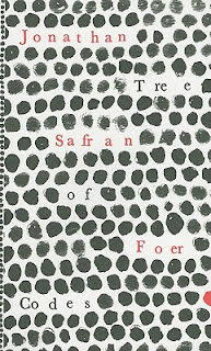
well done, jonathan safran foer. this die-cut book from visual editions renders me mute.
lately it's been apparent that books are undergoing a sort of evolution, in order to regain some footing after the success of their e-counterparts. i think it's working, don't you? not that i would ever use an "e-reader"... but still.
visual editions is a london-based publisher of crazy-making, wildly creative editions. they've just started out, but their work is flawlessly executed, and their designs are flawlessly original. in their own words:
that is all.
happy saturday of solidarity!
cheers.
well done, jonathan safran foer. this die-cut book from visual editions renders me mute.
lately it's been apparent that books are undergoing a sort of evolution, in order to regain some footing after the success of their e-counterparts. i think it's working, don't you? not that i would ever use an "e-reader"... but still.
visual editions is a london-based publisher of crazy-making, wildly creative editions. they've just started out, but their work is flawlessly executed, and their designs are flawlessly original. in their own words:
"the way we think about visual writing is this: writing that uses visual elements as an integral part of the writing itself."you should totally look at their version of tristram shandy. i love this type of thing. i may not be fully capable of reading it straight through in one sitting, but i definitely want to own it.
that is all.
happy saturday of solidarity!
cheers.


Comments
Post a Comment